
How to take decent photos of record albums
Thank you to John Purlia for contributing the following. Check out John’s site Wind-up Dreams and Vinyl Nightmares too!

French Pastry – Eddie Barclay & His Orchestra
Who here likes vintage album covers? Okay, basically, everyone! Vintage records are cool! They’re big! They’re bold! They’re colorful! But best of all, they often feature wholesome looking gals of decades past acting as naughty and provocative as the standards of the day would bear. What’s not to like?
Collecting Vinyl
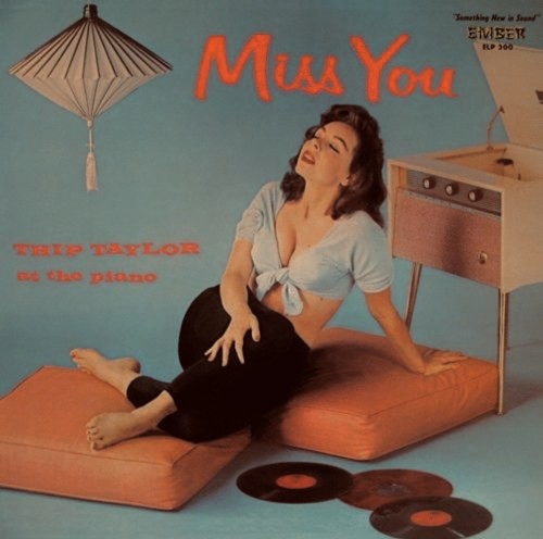
To the right is one such vintage album find, French Pastry by Eddie Barclay & His Orchestra, released by Mercury Records in 1958. Yes, that’s 53 years ago! Sadly, they just don’t release covers like this anymore, and the world is surely a sadder place. Once upon a time, record and department stores were filled with beautifully cheesy covers like French Pastry, printed in all their 12″ square glory on glossy cardboard sleeves. But today—with most music sold digitally or on compact disk—all you get is a teeny tiny jpeg or a skimpy little booklet crammed into a 5″ plastic case. Still, visual treasures of the past wait patiently in thrift shops and garage sales, in dusty attics and dingy basements. Vinyl collecting is on the rise as new generations of music fans discover the undeniable appeal of LP album covers.
Web sites dedicated to vintage vinyl collecting can be found all over the web with more blogs popping up all the time sharing the best, wildest and most exotic that vinyl has to offer. My own humble collection is shared on several sites, with galleries available on Facebook, Flickr, and MobileMe.
Where do all these images come from? Is there a vast database somewhere akin to Amazon or the iTunes Store where seemingly every album cover ever released is available for download? Nope. You won’t find French Pastry in iTunes and the image that appears on Amazon falls into the “don’t do this” category we’ll discuss in a moment. In fact, some of the very best strange-but-true garage sale finds can’t be found anywhere on the web. So… if you plan on sharing your cover collection with the world, it’s up to you to create a decently postable image that can be shown off with pride!
Ideally, the task of digitizing your vinyl treasures would be as simple as laying your album covers onto a scanner bed to capture the spectacular artwork. Unfortunately, as very few commercial scanners feature a platen that will accommodate the 12″ horizontal and vertical dimensions of a record album, your next best bet is to set up a makeshift Album Cover Photo Studio and shoot photos of your collection. We’re not talking anything fancy: no light tents, fancy soft lights or expensive gear. Just a few simple tips and techniques using a point’n’shoot camera to take photos every bit as nice as the covers themselves.
A little diversionary history
I began photographing my LP collection a couple of years ago as a means of building a database of images I could quickly reference when planning new photos. As many of you know, my fine art work uses vintage LPs, books, and other printed material as backdrops for the three dimensional scenes I build and photograph. With my LPs stored in iPhoto, I’m able to open the Record Covers album, and leisurely flip through hundreds of covers as I consider whatever narrative theme I next wish to explore. This is a lot easier than flipping through crate after crate of poly-bagged record albums that line one wall of my studio.
Over the past couple of years I’ve shot close to 500 images of album covers, and (for the most part) the images I’ve captured look pretty great. Oh, sure, not every cover I’ve snapped is picture perfect (and I do plan on going back someday and correcting those anomalies), but the standards for snapping a nice web-friendly picture of an album cover is somewhat below MOMA-quality photography. The “good-enough” bar you set for your record collection will be up to you.
Learning from the mistakes of the masses

To get started, let’s learn a little from a set of photos that don’t at all do justice to the great cover imagery they mean to capture. When I see photos like these I imagine the son or daughter of a vinyl aficionado liquidating dad’s lovingly cared for collection, one album at a time, as if they were snow globes at a Waikiki giftshop. To the right is a photo typical of internet auction sites, where cover art photography often takes on the feel of a slipshod assembly line: set ‘em up, snap the shutter, next! Here, the record is propped up on a table and leaning against a wall, with the photo shot standing a couple of feet away. Let’s see how low this shot scores on the entirely arbitrary Bad Album Photo Scale:
- The flash is reflected off the glossy cover. -200 points
- The perspective is way off. Aren’t album covers supposed to be square? -1000 points
- The text is very difficult to read. -50 points
- The final photo isn’t cropped. -25 points
Our grand total of -1275 is atrocious! Here’s another example of what not to do…

For some reason, people think they can take a good photo of an album cover if they lay the cover flat on the ground and shoot it from overhead. Actually, that’s not a bad idea, but neither is it a good idea. Unless you have a super fancy tripod that provides for overhead shots, it’s unlikely that you’ll be able to hold the camera still at a perfect 90° angle. Plus, just think of how ridiculous you’ll look straddling over the record shooting down between your legs. And even with the aforementioned super fancy tripod, the camera (unless your lens is also super fancy) is likely going to be too close to the record to avoid excessive optical distortion like the dreaded barrel effect.
Again, as with the previous Don’t Do This shot, the flash is turned on, just to reinforce that you should definitely not use a flash when photographing album covers.

A variation of the flat-on-the-floor technique is the flat-on-the-table technique, see to the right. News alert! Getting the lens perpendicular to the surface is even more difficult when leaning forward over a table, so most aspiring album photogs end up standing beside the table and shooting down at an angle of roughly 60°. I call this the Star Trek Opening Credits effect. Some auction sellers try to pretty-up the flat-on-the table technique with their own variations: flat-on-the-bed or flat-on-an-ugly-quilt. But they fool no one!
One more, shall we?

Ooooo… look! It’s picnic time at the Home for Jaundiced Swingers! Just like you don’t want yellow pictures of real people, you don’t want yellow pictures of the ultra hip people on your incredibly cool record albums. Let this photo be a reminder to match your white balance to your lighting. Use whatever tricks you have up your sleeve: gray cards, controlled lighting, camera presets… just don’t post yellow people to the web!
Some What not to do Rules
Let’s summarize what we’ve learned from all the really bad photos:
- Do not use a flash.
- Don’t shoot from an angle that alters the record’s dimensions.
- Don’t place the camera too close to the album cover.
- Did I mention not to use a flash?
Setting up your own Album Cover Studio
Finally! We’re now ready to begin talking about “how to take decent photos of record albums” (and thank you for reading this far). And guess what? It’s really not that hard! All you have to do is keep the camera steady, set it far enough from the album to avoid optical distortion, and aim right at the very center of the cover. Easy, right? Maybe so, but hopefully the tips below will prove useful in improving the quality of your shots.
First… determine where you’re going to be taking your album cover photos. A formal studio with a light tent and special lighting is nice, but not really necessary. In fact, I rarely use my studio when photographing records; it’s just too much trouble to pull out the light tent, the floodlights, the high-tech space-age tripod, the “nice” camera, etc…. Here’s what to look for when choosing a place to take album cover photos:
- Good light. Make that really good light.
- A table or level surface that’s up, off the ground.
- Enough space in front for a tripod and “distortion elimination distance” (4 to 6 feet is good).

I use the sunroom off my bedroom (formerly, an open balcony when my house was first built 80+ years ago) for my Album Cover Studio. This is a perfect spot for shooting album covers, as I get lots of natural light and have a low bookshelf that’s just the right height for setting up covers and shooting them with my Canon SD1000.
My setup is to the left. In the background is the main work area, where each cover is placed and photographed. I’m very fortunate to have a large window over the bookcase that faces due west. There is also a bank of windows to the right, so I usually shoot covers mid morning when the sun is directly over the house and not yet spilling in through the windows. With so much bright natural light coming into the room I’m able to use the auto white balance setting on my point’n’shoot, and rarely have to make white balance adjustments in post processing. The arrangement is also nice, as there is space to the left for a stack of yet-to-be-photographed records, and it’s quick and easy to move records from the stack to the “stage” and off to the right to be “re-sleeved” and filed away.
If you can’t use natural light, select a room with as much artificial light as possible, and remember to set the white balance on your rig accordingly.
What you’ll need
Next, let’s take a closer look at the work area.

I use a pair of black mats to act as a backdrop (Hey! You could use a large grey card to later calibrate the white balance! How about that?) and base. The base mat serves two purposes: one, there is a hash marked on the left side to indicate where the edge of each album is to be placed, and; two, it eliminates reflections from glossy covers.
Though you can’t see it in the photo, the background mat is propped up using a standard metal library bookend, which also serves to hold the cover as vertical as possible. Over the years, I’ve gotten pretty good at balancing album covers a hair’s breadth from the tipping point, but here’s a nice tip for insuring that your covers remain vertical: use a second bookend placed near the right edge of the album and secure the cover with a paperclip placed just inside the back cover, like so:

Setting the album cover at a nice 90° vertical angle is essential to eliminating many of the perspective problems we saw in the set of “bad cover shots.” Up and down perspective becomes skewed as your camera moves below or above the album’s vertical centerline, while left and right skewing is introduced as the camera moves right or left of the horizontal center. Basically, you want your lens to be square to the very center of the album cover, which in most cases is 12 ³⁄₈ inches square. Think you can eyeball these dimensions? Don’t kid yourself! The eye and the brain are funny things that frequently agree on matters of perspective. But until you get your carefully eyeballed photos before the rigid constraints of the Straighten and Crop tools on your computer, you don’t really know how bad we are at judging fine angles and distances. Compounding this unfortunate human reality, the closer your camera stands to a square, flat object, the more pronounced seemingly minor miscalculations will appear in the resulting image.
Luckily, we have marvelous inventions like rulers, tape measures and T-squares to assist our lying eyes.
Setting the tripod height

We can find the vertical center of a typical cover by placing an album at the edge of our workspace, and measuring the distance from the floor to the top of the cover. Then, simply subtract half the cover height and you have the distance from the floor to the center of your lens. In the example above:
40 ⁵⁄₈” — 6 ¹⁄₈” = 34 ½”
So, in this example, the height of my tripod—from floor to the midpoint of my camera lens—is measured out to be exactly 34 ½ inches.
Hey, wait a second…. Didn’t you earlier say that album covers are 12 ³⁄₈” square? How come you’re using 6 ¹⁄₈” , which would be half of 12 ¼ inches?
Well, yes, I did, that is the correct standard, but in practice you’ll find that most older covers seem to be 12 ¼” square. Perhaps they shrink… like grandparents. Besides, do you really want to deal with 16ths of an inch after halving the height?
Finding the horizontal center
Determining the horizontal center of the album is again very simple. The center will be half the width of the album, measured from the left edge. Again, assuming a width of 12 ¼ inches, the horizontal center will be 6 ¹⁄₈ inches from the left edge. So, with an album in place on the “stage,” measure 6 ¹⁄₈ inches from the left edge of the album, set a mark on the base mat, and align the tripod so that the camera lens is centered on this mark. Easier said than done, since we haven’t yet talked about the distance between the album cover and the tripod. For now, just note the center mark and place the tripod as close to the album cover as possible with the lens aligned with the center mark.
Note: If you’re using a camera that supports auto focusing points, you can get really fancy by placing rubber bands around a test album at the horizontal and vertical middles. Where the rubber bands cross is the absolute center of the album cover. Move the tripod horizontally from left to right while keeping the camera perpendicular to the album cover (do not swivel the tripod head, as this will alter left/right perspective), and use the center autofocus point as a guide for finding the point at which the rubber bands cross. When the autofocus point is dead center over the crossing point—bam!—you’ve found the horizontal center of the album cover.
Setting the distance from the camera to the cover
Remember, close is generally “not good.”
How can that be? Close is always good! Look at this fantastic photo I took of a bee pollenating this sexy flower!
Close may be good for the amorous ways of nature, but it introduces lots of problems when photographing square images. Imagine, for a second, that you have super wide angle lens and place your camera one inch away from the center of the record album.
Great! See? It’s just like bee porn!
Ah, you may be one inch from the center, but geometry tells us that you’re now also 6 inches from the edges, and 8 inches from the corners. Good luck with that. Next, think about all those street-level photos you see of buildings, where vertical walls seem to shoot off at diagonals towards the corners of the picture frame. Yet, buildings shot from the distance appear as they rectangularly should. From closeup, the angle between the camera and the building’s edges is very wide, approaching 90° as you’re about to press that expensive lens to the granite facade. As you pull the camera back, the angle becomes increasingly small, approaching zero as the building fades off into the horizon.
The same holds true for album covers. As you pull the camera back from the center point, the angle to the edges and corners becomes smaller and smaller, and the picture you take will become, well, more album-like, with straight edges and nice 90° corners.
The same effect is achieved by increasing the focal length. But don’t go too crazy; there’s no need to slap on your telephoto and shoot your album covers from half a block away. Depending on your camera and lens, a focal length of around 17 to 20mm should work great. On my Canon SD1000, I zoom to 3x, which is the optical limit for my camera before going into digital. This works out to a focal length of 17.4mm.
Note: You definitely don’t want to use digital zoom when photographing album covers, or pretty much anything else except for spy surveillance photos that are intentionally all pixelated and blurry to raise “reasonable doubt” when you present your “clandestine mob meeting” photos in court. Digital zoom is evil; it’s like taking an jpeg of an postage stamp and blowing it up to the size of a building.

Getting back to our example, turn on live display mode and zoom to a reasonable focal length (as above, the 3x level for my SD1000). Initially, the LCD display will be filled with a zoomed portion of the album’s center. Slowly pull the tripod back along the horizontal center line, being careful to keep the camera parallel to the plane of the album cover. If one side of the tripod scoots back a little more than the other, so too does that side of your lens, and you’ll be introducing left/right perspective skew. You can see this effect through the LCD display: the album may be horizontally centered in the frame, but the top and bottom edges on one side will appear slightly taller than the edges on the opposite side. Isn’t geometry fun? (Or, frustrating?)
Note: Feel free to use a T-square, a fancy laser level, equal lengths of string, or whatever other trick you may have up your sleeve to remain on the centerline. I use the seam between the boards of my hardwood floors, which are perpendicular to the bookshelf workspace.

Pull back far enough for the entire cover to be visible on the LCD display. Unless you have a very steady hand (and have made absolutely precise 16th of an inch measurements), you’ll invariably introduce a little bit of left/right skewing to the image in the LCD. No big deal. If the right edge looks a little taller than the left, then the right side of the lens is a little closer to the cover than the left.
You could correct this problem by nudging the right side of the tripod back just a hair, but once you start fiddling with the tripod you’ll soon find yourself in a frustrating battle of left/right overcorrection.
A better solution is to make these final fine adjustments to the album cover itself. It’s much easier to move the right side of the cover back a smidgen, than it is to move the tripod—especially if the album cover is being supported by a moveable object (like a bookend) as opposed to a wall or window.
Finally! Let’s take a picture!
This is the easy part. The camera is far enough away to reduce distortion, it’s at the right height, and the lens is pointing at the very center of the album cover. But before you shoot that vinyl envy photo, carefully check the LCD for any unwanted glare or reflections. Some of the very best album covers frequently sport high gloss covers that will produce glare or reflect light in unwanted ways. You could eliminate glare with a circular polarizing filter (and I will applaud your dedication), but remember—we’re leaving all the fancy equipment in the studio, and you’re unlikely to have a filter available for your point’n’shoot. I typically eliminate unwanted sources of light by shadowing glare spots with additional black mats or cardboard card. Or (since I use natural light), I just wait until a time when the sun is in a different spot in the sky.
My cover photos are all shot in Manual mode with the flash turned off, and I pretty much allow the camera to do everything else, though I sometimes increase the exposure time if the light is lower than desired. We’re shooting on a tripod so we have the luxury of longer exposures. Your particular lighting conditions will certainly dictate the camera settings. Just remember to turn off the built-in flash!
Post processing
Click! We have a picture.

Above is the captured photo—black mats and all—in iPhoto’s full screen editing mode. Depending on how well you were able to level your camera and keep it square to the cover, you may wish to apply a small amount of straightening so that text and vertical images aren’t tilting out of control. Luckily, in the example above, the lines appear to be pretty true.
Next, use the Crop tool to edit out everything but the cover, as illustrated above. Don’t worry about cropping your image absolutely square; few album covers measure precisely 12 ³⁄₈ inches along every side. The best you can hope to do is keep every corner of the Crop tool inside the dimensions of the album cover. In any case, the final, cropped image will be reasonably close to square.
Note: When cropping covers like the one above, where the original image has been pasted just inside the edges of the cardboard sleeve leaving a border around the image, you may find that the edges of the crop tool will cut into that border, resulting in thin slanted “slivers” around an otherwise square album cover. In these cases I simple crop inside the border, leaving a nice, square, full bleed image.
That’s it! All that’s left to do is apply image adjustments to your heart’s content. Now, get out there and get your cool cover collection up on the web!
And more:
Hello,
LOVE your site!! (said the poor boy).
I was looking for some collaboration on a few of my FLORA and “FLORA?” LP covers – and naturally came to your site to find a lot of his covers in 1 place.
After that research I looked at (I believe it was your “blogroll”) and went to the article on record cover restoration. While I thought it would deal with cleaning, repairing, touching-up, etc. of actual covers, which I, as a past and sometimes still document / art restorer have quite a few tips …but for another day on that …this ‘blog’ (by you, or by a person you link to?**, I wasn’t sure) dealt with the problems of cleaning up less-than-optimal photos of covers for online presentation. As it happens I am quite conversant in that also and would like to pass on at least this one HUGELY time-saving tip – that also yields incredibly better results.
**If this blog/article is NOT by you – and you merely share it for the other person, please pass this info on to him – and feel free to give him my eMail address for any Qs he might have. Those pages did NOT include any kind of contact address, link or mechanism. So I am reaching you through your main page contact link.
Regarding cleaning up / removing wear, writing, stain spots, stickers etc. from TEXT areas in Photoshop:
The operation of manipulating/adjusting brightness and contrast will almost always lead to gruellingly tedious pixel surgery – and ultimately leaves the treated text looking patchy, soft, blurred and rough. It’s usually a losing proposition to try to hold onto the font integrity (ESPECIALLY black text on white or light background) while changing contrast/brightness.
You (or blogger) talked about separating out inner elements and -after fixing background- dropping back-in these pixel-doctored text sections. All that mind-numbing time spent on the pixel-doctoring is unnecessary.
INSTEAD (since you or blogger were OK with boldly going in and making wholesale changes to these poor images – in service of a return to the original look of the art) the answer is to REMOVE the text – and RETYPE it.
No it is not that hard to do. Here is why it is FAR faster and always more accurate than paint/erase/smudge/etc. attempts (even for us pros).
A) with this cleaned-up background on the screen, open the unaltered photo – in a separate photoshop document (at same size/resolution as your ‘background’ working document is now). Right in front of you (in that original) is your roadmap for the correct style, size and (here is where I think most folks fear to tread) letter spacing/leading to assure an exact match.
B) using a matching font/size/weight (you no doubt have all the usual suspects for body-text: the arial, arial narrow, helvetica, garamond, futura, Times, Times Roman, Palatino, yada yada font families, installed in your computer. If you do, then any properly installed photoshop utilizes ALL fonts that are in your library. If you do not, these fonts are easy to get, often free – from VERY safe, professional font-houses or their agents. Get them*†* I can help …OK, NOW: using the matching font at correct size, retype what you see in the original, into the correct position of your working document (basic denuded, color corrected background area of cover – as already explained in the blog) – of course you can fine-tune POSITION and SIZE at any point in the process before merging the layer (or before ‘rasterizing’ the type if your photoshop demands that. Most do now).
Here is THE KEY what most folks don’t know they have: PHOTOSHOP has a gizmo in the toolbar (should be an icon toward the right-of-center area on your toolbar that looks like a stylized “page”). Click that little sucker. Did you do it? LOOK at all the stuff there you can do to make YOUR lettering EXACTLY like the lettering on the LP cover! Same leading and line spread (tight, loose, open or even W a y o p e n, as some titles are done. THIS is what saves you all the time and headache. (confession: I type REAL slow. I have already been here over 1 hour and a half writing this. BUT: even a 2-finger monkey on the keys like me can get the cover-fix done MUCH faster and FAR cleaner, more EXACT by retyping – even if it’s Leonard Big-Wind Feather you are dealing with. Use that “character and paragraph pallette”. Take an afternoon and just play in it. You’ll be an ace in no time. There will be virtually no text area that you can’t replicate with
ease.
btw, the supposedly matched colors that all that patching did (on blog examples like the Capitol orange swirl 45 label, were showing all the patched areas from pixel manipulation work. It was NOT a clean, continuous, seamless color background. Lots of patchy color/contrast/brightness mish-mash when you look closely. Of course it is even MORE exhausting and mind-numbing to re-fix that – and virtually impossible once you’ve rebuilt everything back into place – and AFTER a merge? fuhgetaboudit. SO: avoid all that messy, unnecessary work, by the shorter route of retyping. Photoshop HAS all the abilities to correctly replicate your text and line style. And it looks SO much cleaner.
Hope this helps!
~jeff Helwig
P.S. also go VERY easy on that “sharpening” of text. It easily gets to look like a spiky, wet tabby cat, especially on (and most of it IS) small type.
INSTEAD of using SHARPEN – or even the normally much better “unsharp mask” – use the “smooth/crisp/sharp/strong/none” feature in the toolbar. It will be RIGHT in front of you simply displaying the ONE (1) word: “crisp” or “none” or “smooth” etc. That is a drop down. **with your TEXT SELECTED** you can assign the preferred property to how font edges meet the background. You should be RIGHT UP at 400% to 1200% size when you do this, so you can REALLY see which style best matches/heals the text – and you can recognize artifacts all the better as well. a little (very little should be needed now) sweepy-clean-brush-smudge here can go fast. If you SHARPENED it though, you will be full of artifacts to pick at. Don’t ‘sharpen’ fonts.


March 21st, 2012 at 12:15 am
thank you for this.
i’m almost done scanning my 800 7″ records, and have been looking forward/dreading to getting the LP’s scanned/shot for a while.
for as many vinyl ripping tutorials as there are, you’d think there’d be more regarding shooting their covers.
i’ll definitely use many of these techniques when it comes time…
March 22nd, 2012 at 6:54 am
Oui, merci boucoup Monseur VBJ and the Madmoiselle Pastry Dish is magnifique!
March 26th, 2012 at 9:18 am
I wanted to contribute to this with some helpful hints. I have been balancing the pros/cons of scanning versus photographing for a while now. My entire issue was that most scanners were too small to scan a cover in one swipe, and to do multiple swipes meant some sort of “stitching” had to be done to get the entire cover. I was also not in a position to purchase photo equipment. I am happy to report that my search for easy to use stitching software has led me to ICE, by Microsoft no less! This software is great, but it does have system requirements.
It does work on Windows platforms ( I have XP). My laptop, a dell, which I have vowed to keep off the internet and devote entirely to music and lp cover stuff is what I am using. Nothing fancy. XP has to have Service Pack 3 (i got the standalone off the net, saved it to a flash drive, and installed). There is also NET Framework 4, as well as an image viewer that you will need before you can install ICE. If anyone needs detailed instructions, please let me know.
This may seem like quite a process, but I guarantee, the results are worth it. I will be submitting some of my favorites very soon!
June 23rd, 2012 at 4:28 pm
I tried scanning my LP covers a while back with an A4 scanner – definitely not for the faint hearted – 4 scans per side and a lot of work getting the rotated and joined – and then there were the blemishes – worn covers, creases and additional materials that seemed essential (Hawkwind Log, Pink Floyd stickers, lyrics inserts, etc).
Looks like that photography was a better bet.
June 25th, 2012 at 12:23 pm
Hey Stewart!
If you would like, I can e-mail you how to use ICE to join your scans seamlessly (and easily). It really works well and you dont have a to be a techy to use it
July 10th, 2012 at 9:07 pm
Thanks for the great tutorial. I’ve used a simple method with good success and I’ll be sure to try the suggestions on this website. When everything else failed I wound up placing the album covers along a ridge of our white garage door and photographing the covers in mid morning daylight. Generally the results were quite satisfactory. The photo editing software did a great job of eliminating any traces of the garage door and using the color balance options produced a very decent image.
August 20th, 2012 at 6:19 am
But what about when you want to take a photo of the vinyl? Any tips on that?
August 29th, 2012 at 7:50 am
What a load of bollocks. To photograph the cover you simply scan at 300dpi. Place the cover on the scanner bed. It does not fit, that does not matter, scan it and move it along and scan the other half. Install Photosuite 4 on your computer. You scan the two halves of the cover into Photosuite 4. Then select the Stitch facility, follow the instructions and you have your cover scanned in great detail. You can scan back and front and inside gatefold sleeves in the same way. Also lyric sheets and inserts etc. You can also scan the record in the same way. Remember 300dpi is the resolution to scan at. Simple. You also can scan anything else in this way, maps, large photos or documents. You can also stitch three scans together. Inexpensive programme and a very useful feature. Contact me if you like for any questions de3de@hotmail.com
August 29th, 2012 at 7:54 am
By the way, I can submit ‘proof’ of my scans and I challenge anybody to find the join. Only two scans are required for each side of the album cover. If you are only doing the front then you will need two scans. You start by opening the programme Photosuite 4 and you scan into Photosuite. Then you select Stitch and it does the rest, takes no time at all.
January 20th, 2013 at 11:04 pm
I have been recently collecting a large number of rare/sealed disco albums from the late 70’s, and have been collecting 12″ singles (remixes) from the 80’s since I was a kid. In my opinion, I think photographing anything is putting space between the actual article and the item–it’s not an actual copy of the surface. I believe scanning is the way to go. Typical professional submissions for artwork are scanned at 300dpi. I sometimes go with 400dpi for 12″ album covers, a little higher for 7″ vinyl covers, and even higher if I ever scan CD inserts. I have a scanner that is over-sized, and scans the entire record album in one swipe. The only problem is when you scan something that was released, you have no bleed area. So you have to be very careful when cutting it precisely.
I remaster all my vinyl into digital computer files, and then also have hard copy CD’s as backups. I cut the artwork as CD inserts. Sometimes, the album art or 12″ art will have a natural border to it. For example, I am remastering a disco album by the group LOVE AND KISSES right now, and it features a woman on the cover getting her shirt ripped–and there is a red border around it–so you get lucky sometimes. : )
While I do really respect all the effort and precise direction and explanation that the writer of this article has put forward, in my humble view, I think scanning is the way to go. My scanner was under $1000, and it does a beautiful job. I use windows–will never use Apple–and a simple photo editing program like Photoshop (even an old version) is ALL you need.
It has layers… so if you ever want to scan something larger (like a poster) and you do it in pieces and want to “sew” it up–you don’t even have to bother with automated programs (which don’t always do a great job anyway). You can simply make one layer 50% visible, and align it with the layer under it–then bring both layers to full opacity of 100% and cut and trim one. It appears seamless.
The only reason someone would not want to go the scanning/digital remastering route is if they were uncomfortable with computers. But it really is worth learning and provides, in my humble opinion, a more true and higher quality image of the original album art than photographing vinyl. When you scan, you aren’t taking a distance/lighting/photographic image–you are actually taking a “face to face” copy of your album.
Good luck people.
For anyone interested in their 1980’s remixes, or some great and rare (not the village people, not gloria gaynor…) disco gems, you can check me out on facebook and give me a shout.
Sincerely,
Mathew J. Russo
ILLINOIS
April 7th, 2013 at 7:23 pm
I tried some of your suggestions, but the photo finisher loused up the end product by overblowing the prints (their standard procedure) and cropping off the top and bottom of the covers.
July 16th, 2013 at 11:11 am
The technology has leapfrogged the need for this.
Try the Camera Awesome app on iphone or better yet ipad.
it has a square framing option
it has a level option
it has separate focus and exposure option.
Oh yeah, does light balancing.
Enjoy.
September 12th, 2013 at 2:48 pm
Now that I’ve made the photos, can I post them on art website for sale?
October 1st, 2013 at 2:02 pm
Thank you so much, really great to read all this, feel encouraged now to get my collection photographed!
November 1st, 2013 at 1:06 am
Thank you for all your effort creating this interesting article. I found you by specifically searching for “how best to digitise LP covers”. A while back I tried scanning LP covers using a Canon LIDE 25 A4 scanner and then trying to stitch all the partials together with Photoshop Elements. I even bought a releatively cheap Mustek A3 600 Pro scanner to reduce the number of partials required. In practice I found that the bevels around the scan glass always added a slight tilt resulting in a small optical distortion in the scan. This showed up when trying to stitch up the partials together in Photoshop elements or various Panorama making programs; the overlaps between the partials would never quite match up, leaving me unhappy at the eventual results. In the end it was often a lot quicker and simplet to scan or download a scan of a CD cover from the Internet and make do.
However some LPs don’t get a reissue and some reissues on CD don’t duplicate the original artwork. There seems little point making lossless digital archives of the LP without doing justice to the artwork too. So I have an itch I need to scratch!
This article above contains a lot of sensible practical advice I am sure I will find invaluable. I have never been that into photography but your hints and tips are just the job for a novice like me.
It seems a shame that there doesn’t seem to be a free web archive where good quality LP cover artwork could be uploaded for the benefit of all interested parties, especially as the survival of that artwork may otherwise disappear. If I am going to make the effort to photograph 2000+ LPs it seems a shame that I can’t share the outcome, especially as there can’t be much commercial juice remaining to be wrung out by the copyright holders.
Anyway, thanks again for your advice.
November 24th, 2013 at 6:49 am
Lot of common ground and common solutions in this kind of “product photography”
I’m interested in shooting the vinyl itself, on account of the all-important etchings on the vintage pressing. So far I haven’t found a way other than photoshop slog doing HDR-type routine digitally
http://londonjazzcollector.wordpress.com/about/ljc-shoots-records/
Interested in any ideas others may have. The cover is the easy bit, believe me
Cheers]LJC
November 26th, 2013 at 7:45 am
Can she deliver the French Pastry & Pumpkin Pie on Thanksgiving? If so I want SECONDS!! Please tell the Rockettes on Thursday I said” HAPPY THANKSGIVING!”
December 17th, 2013 at 10:46 am
I am a graphic designer and I have designed artwork for a client’s poetry book. The artwork includes 3 record album jackets that I could only find on-line. If I were to scan or photograph these jackets rather than use the image from the internet, do you know if I can use them in this book without violating copyright laws. I have looked everywhere to get permission to use them and I have not yet found the owner of each copyright.
Thanks!
April 20th, 2014 at 1:10 pm
It is definitely easier to photograph the covers, if you have the right equipment. Scanning is such a headache.
July 22nd, 2014 at 3:29 pm
I agree that shooting photo’s with an inexpensive digital camera is MUCH better AND faster than scanning all those covers. Once you get your process sorted out it goes pretty quick.
August 17th, 2014 at 7:55 pm
What about photographing at an slight angle (and at a higher resolution than your final image file will be) and performing a “perspective correction” and downconvert the resolution?
Then you don’t have to worry about the reflection and you can use the flash.
November 25th, 2014 at 7:59 pm
To #15 David (http://lpcoverlover.com/how-to-take-decent-photos-of-record-albums/#comment-161378) You can share your images on http://www.discogs.com. They’re quite strict but it’s a pretty good site to get info on all kinds of stuff – vinyl, CD, tape.
January 2nd, 2015 at 6:09 am
Great article on sleeve photography on a fascinating website. Any tips on photographing the actual vinyl to highlight nice clean and (hopefully) unscratched surfaces?
August 8th, 2016 at 2:43 pm
Any suggestions on how to eliminate reflections when taking pics of a cover that still has the original shrink in place? I am using a tripod, low shutter speed, black mats below and behind.
Thanks!
August 9th, 2016 at 1:21 pm
With a shrink, it’s wrinkled, the angle of light reflection is all over the place, you don’t have a chance of finding an angle which is reflection free. All you can do is make it a feature – it’s a shrink! – or take the shrink off, its warping the cover anyway.
August 10th, 2016 at 7:36 am
TYVM
August 10th, 2016 at 9:58 am
Matte glass or even matte acrylic sheet on top of the shrink wrap should do the trick.
Michaels or any framing shop should be able to supply.
August 10th, 2016 at 11:37 am
I will try. Thanks
August 16th, 2016 at 10:46 pm
This is superb information. I have to take over 600 pictures -front and back – of records.
I also have to take about 500 pictures of books – front and back- I hope I I will find as good information for the books as the one for the records
I’m building an online store to sell these records and books.
Agains thank you
Best regards
Gilles Gauthier
March 14th, 2017 at 5:17 pm
I am scanning some right now with a Plustek OpticPro A320, much better than using camera and I can get over 1`200dpi resolution:
See:
https://archive.org/details/arthusgerardrec
March 22nd, 2023 at 8:45 am
I very delighted to find this internet site on Google, just what I was searching for as well saved to fav